Final, Fee-Choice Painting Reflection: May 30, 2013
1.) My final project was an abstract painting with lots of red. I used a paintbrush and it took me about 3 days to make it.
2.) I think the good/strong parts are my background because it is really outgowing and full of red and it is all abstract wich makes good rhythm.
3.) I could have done a better job with the flame on my painting because I didnt use enough time on it and i didnt fully blend the paints together because i rushed it.
4.) The attribute of my painting is a dark attribute because the background looks like blood spattered all over the wall and i think the color of red i used really reflects the blood on the wall.
5.) I think 2 inportant elements that stand out in my project or rhythm and texture because the blood really just randomly spattered accross and the texture is scratchy and really looks smeared and rough like dried blood.
6.) The inportant princepals are unity and contrast because its all together like a unit and full of bright red color like contrast.
7.) I learned from this project that even though things didnt turn out exactly how you planned, it doesnt ruin everying. I wanted this to be a happyish painting but it turned out dark and i added on to it to make it look good. you can apply this in life so when something doesnt go how you planned to not give up.
8.) First i started with the background and just randomly flowed red on the background. Then i saw that some of the strokes kinda looked like a flame so i used that as kind of a mold for the flame. when i started i didnt really know what i was doin.
9.) My project was by chance because i didnt know what was gonna happen and a challenge i had was my flame didnt want to blend with the black so i let it somewhat dry and then i used that to blend it together.
10.) I think this was a worthwhile project because it didnt limit anything on our imagination and next year in art im taking graphic design and i hope it will be able to help me for my futer job as a graphic designer.
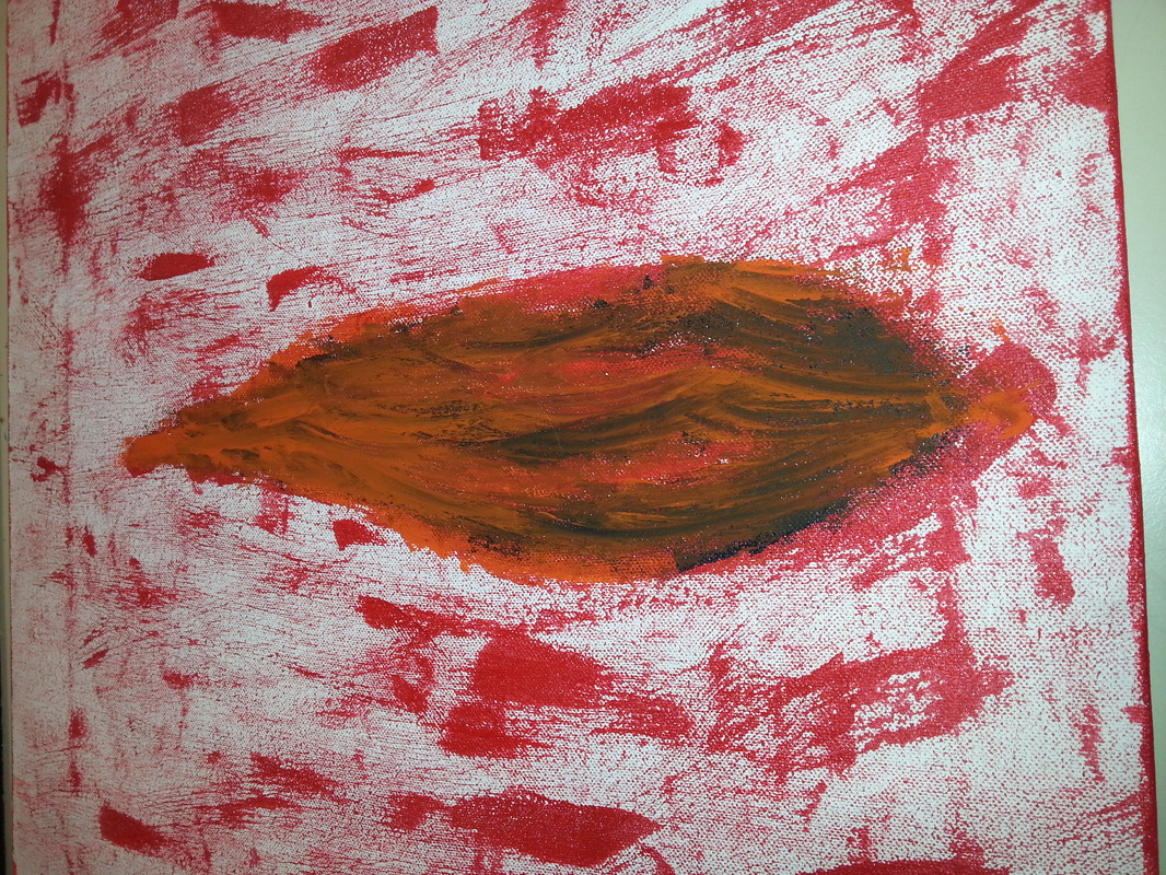
This is an overal picture of my painting. I like the way the flame mixes with the background.
|
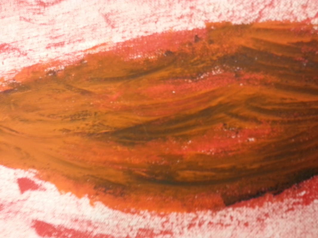
This is a close up of the base of the flame. I like the blending.
|
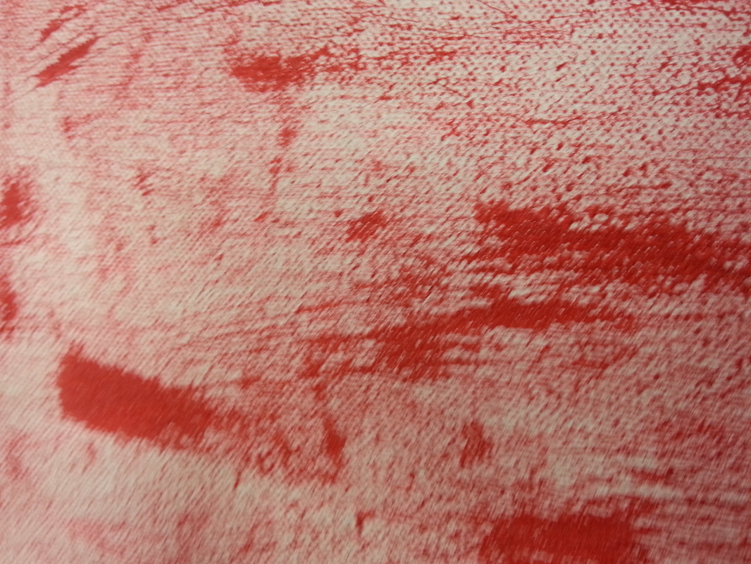
This is my background and i like that it is a random color.
|
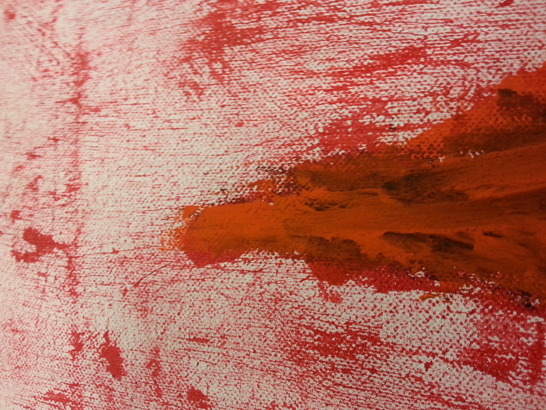
This is the tip of the flame and i like how it is lighter on top like an actual flame.
|
