Non-brush, Monochromatic, Emotion Painting Reflection. April 16, 2013
1.) I think the good/strong parts of my project was my background because it is a depressing kind of blue and it flows accross really well.
2.) I think I could have done a better job of blending the outlines of the symbols with the background and covering up the white spots.
3.) The theme of my painting is Depression and I used the colors and background to show this and the unity is a kind of abstract because the symbols can mean anything along with the color of the background.
4.) The monochromatic color i used is blue and this is kind of a depressing blue. The hue is a kind of Royal blue and this affected the shading and the background.
5.) I did my painting on a canvas and i used a pallet knife to paint it. I used a canvas because it has a nice texture to it and it was challanging to flow the colors on canvas with the knife but it created a knife swipe for the background.
6.) I learned that there are many other ways to get something done that can be applied to the real world. I learned a lesson on how to make sure to flow colors and this is a good general lesson because it can make things look nicer and more neat.
Exceeds
7.) First I drew the symbols and then painted around it. I wanted to use blue so i chose depression. I didnt choose what i wanted to do i just came in and did it. During the process i changed the color of the background because the first blue looked excited and now this blue looks more depressed and sad.
8.) I think this a good project to continue because it teaches how to solve things in different ways and I think you should keep the projects together because it adds to the challange.
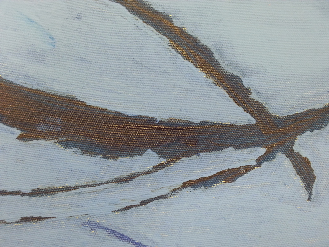
This is a close up of the symbol that i made subconciously
|
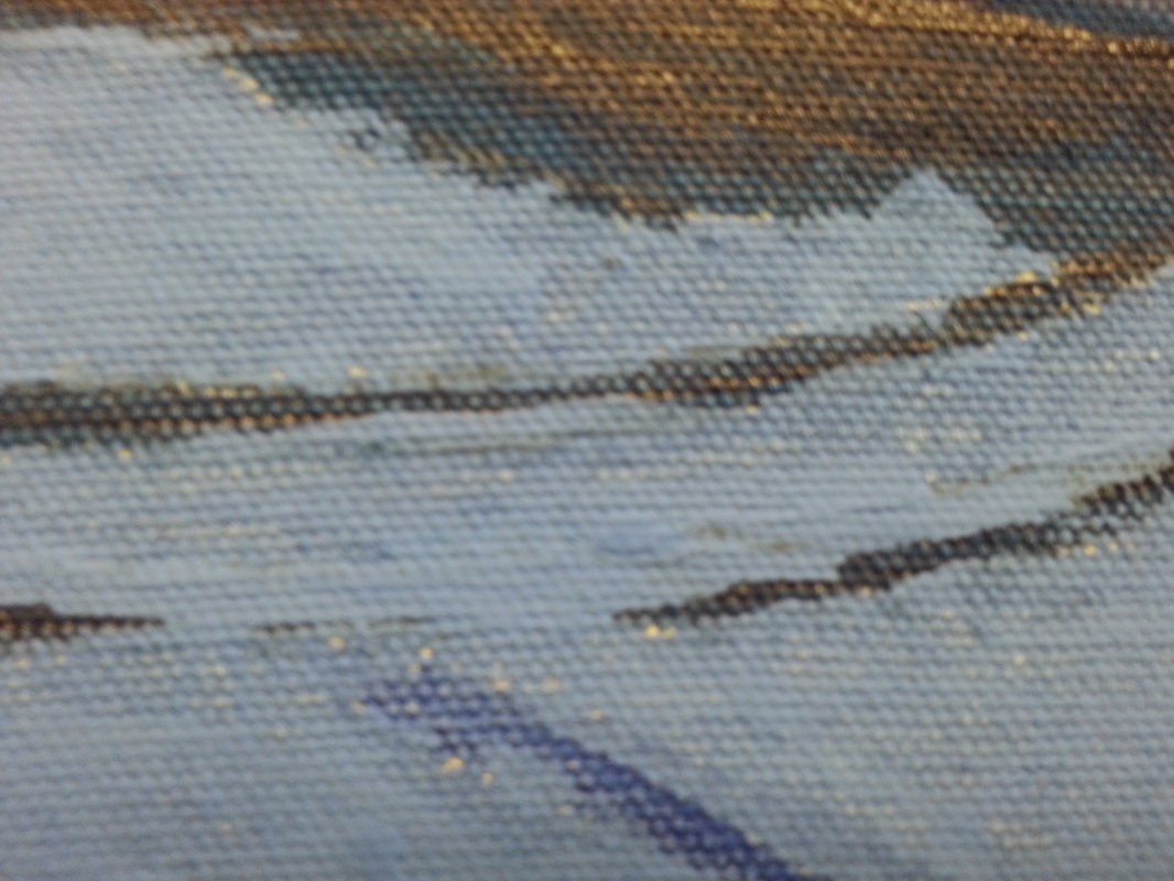
This is a close up of the flow of different blues on my painting.
|
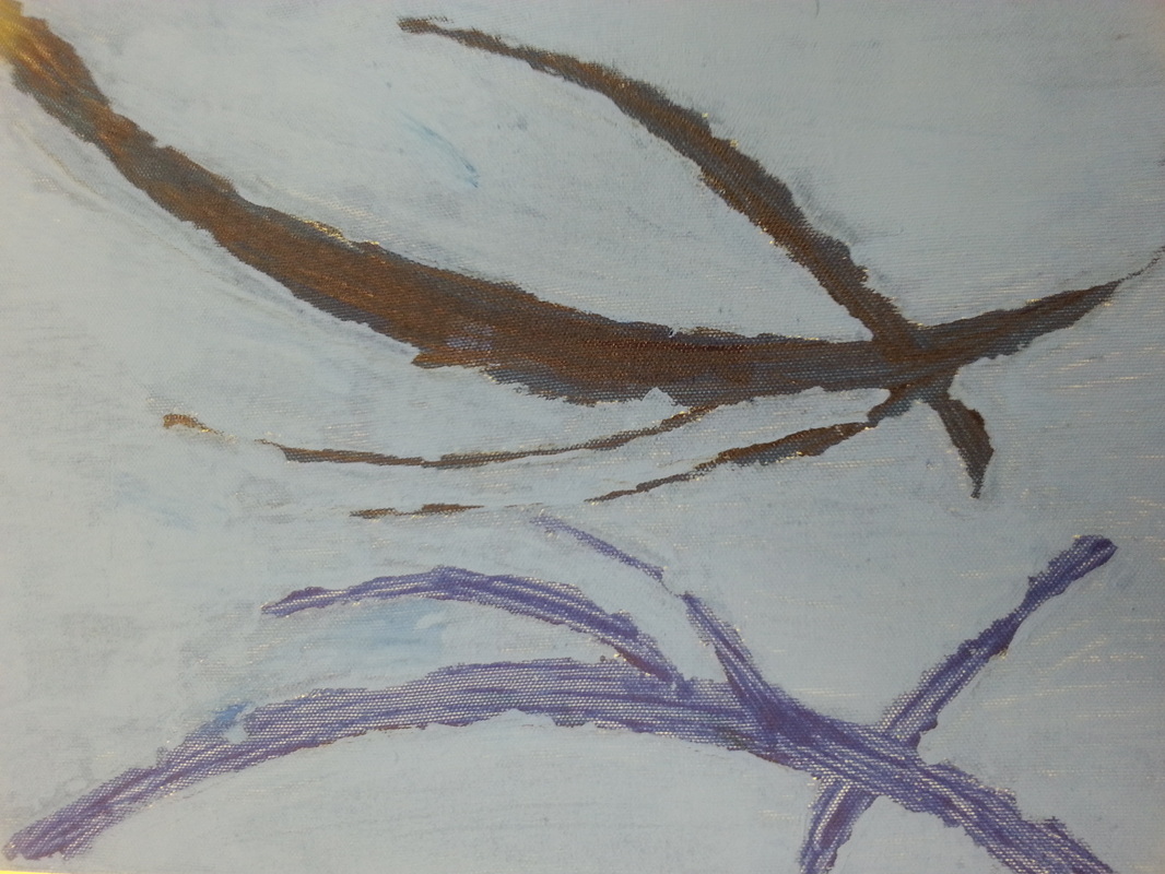
This is the overal picture of my painting and how it shades against the background.
|
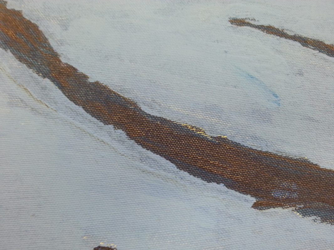
This is a close up of the brown of my symbol surrounded by the blue background.
|
